Our Strategy
Lorem ipsum dolor sit amet consectetur. Diam aliquet mauris ultricies diam lacus lacinia. Morbi donec et eget aliquam nunc. Nulla neque etiam et erat aliquet malesuada donec et.
Lorem ipsum dolor sit amet consectetur. Diam aliquet mauris ultricies diam lacus lacinia. Morbi donec et eget aliquam nunc. Nulla neque etiam et erat aliquet malesuada donec et.
The Process

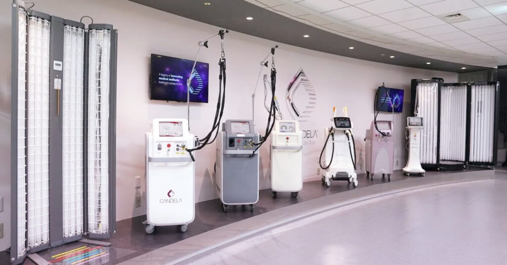
First up was the site structure, developed over 2 weeks through in-person meetings with project team members on both sides and various client stakeholders. With the structure locked down we moved on to the wireframes, developing 18 unique page templates in all for PC, tablet, and smartphones.
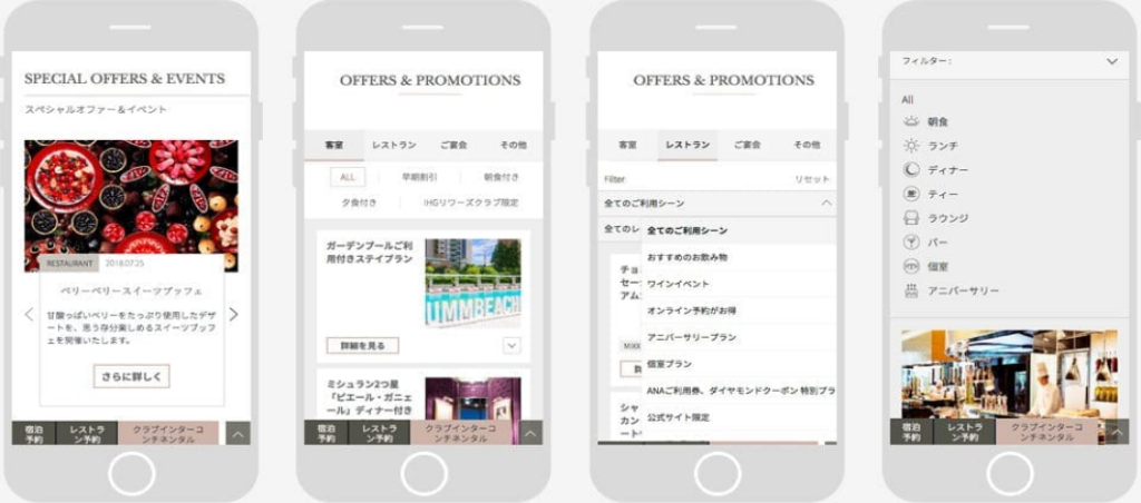
The wireframes comprised two sets, one for Japanese and another for English, Chinese, and Korean. The website architecture was designed to support a full Japanese site, a mostly-complete English version, and a stripped-down basic version in Chinese and Korean. An intelligent menu system allows the navigation and other UI elements to adapt automatically based on the chosen website language.
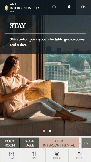

In the end we were able to create an exceptionally well-optimized responsive design that looks and works great pretty much everywhere. Controls are easily accessible, pages load quickly, and global navigation elements are docked neatly out of the way when scrolling down in read mode. And of course it’s fully multilingual.
Design System
Logotype
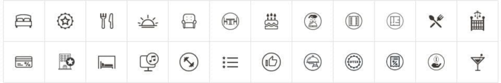
Icons
Typography &Colors
Primary colors


Secondary colors
FONT FAMILY

The Result

Lorem ipsum dolor sit amet consectetur. Diam aliquet mauris ultricies diam lacus lacinia. Morbi donec et eget aliquam nunc. Nulla neque etiam et erat aliquet malesuada donec et.
Lorem ipsum dolor sit amet consectetur. Diam aliquet mauris ultricies diam lacus lacinia. Morbi donec et eget aliquam nunc. Nulla neque etiam et erat aliquet malesuada donec et.
87.9
%
Website New Users
4K+
%
Organic Keywords
230
%
Organic Traffic