Introduction: From Structural Maturity to Experiential Subtlety
Part 1 of this series focused on the visible foundations of Japanese web design maturity in 2026, performance, accessibility, and structure. Those priorities shape what users notice first, including how fast pages feel, how readable content remains, and how confidently people can navigate information-dense interfaces.
Part 2 shifts attention to what is felt rather than seen. In 2026, Japanese UX maturity shows up less in layout or motion and more in how interfaces anticipate needs, respond with restraint, and remove unnecessary friction. The difference is not dramatic on the surface, but it often determines whether an experience feels calm and dependable or quietly stressful.
Here, subtlety should not be confused with simplicity. These patterns are not “minimal” by default, and they are rarely accidental. They are carefully calibrated to reduce anxiety, effort, and uncertainty, especially in experiences where the user is trying to complete something important, time-sensitive, or unfamiliar.
This article focuses on microinteractions, interface behavior, and adaptive UX, and explores how hospitality and intelligence are expressed quietly in Japan, not theatrically, and why that restraint increasingly functions as a competitive advantage.
Why Subtle UX Matters More Today
Before examining these trends in detail, it helps to clarify why subtle UX has become more consequential in Japan in 2026.
- Digital maturity raises the baseline: as users become more familiar with common digital patterns, interfaces no longer need to explain themselves so loudly. When conventions are stable and familiarity is high, UX shifts from teaching users what to do to supporting them without demanding attention.
- Trust sensitivity raises the stakes: over-automation, aggressive personalization, and overt signaling of AI-driven behavior can read as intrusive rather than helpful. When an interface seems too eager to predict, recommend, or intervene, it can introduce a sense of surveillance or manipulation, even if the intention is convenience.
- Broad audiences raise the bar for restraint: when products need to work across a wide range of ages, abilities, and levels of digital confidence, quieter and more predictable UX patterns tend to perform better than novelty-driven ones. They also perform well in high-stakes use cases, including government, travel, finance, mobility, and commerce, where the user’s goal is clarity and completion, not entertainment.
This context also reframes “delight.” In many Japanese digital contexts, delight is often less about surprise or spectacle and more about emotional ease, confidence, and flow. These conditions make subtlety a competitive advantage, not a constraint.
Trend 1: Omotenashi Through Microinteractions
The Non-Visual “Wow Factor” of Japanese UX
Omotenashi as a UX Principle
Omotenashi is often translated as hospitality, but in digital design it is less about friendliness and more about anticipating user needs without drawing attention to itself. Instead of adding decorative warmth, omotenashi shows up through decisions that reduce effort before the user experiences it as friction.
In practice, this means the interface is designed to reduce mistakes before they happen, rather than simply reacting after the user has already made them. It guides the user without scolding or alarming language, and it reassures progress without interrupting flow. The tone is often calm and matter-of-fact, and the interaction model prioritizes continuity over attention.
This can feel different from many Western patterns, which may lean more heavily on alerts, confirmations, or gamified feedback to signal that the system is listening. In Japan, the “listening” is often implicit. The interface’s job is to help the user keep moving forward with minimal disruption or second-guessing.
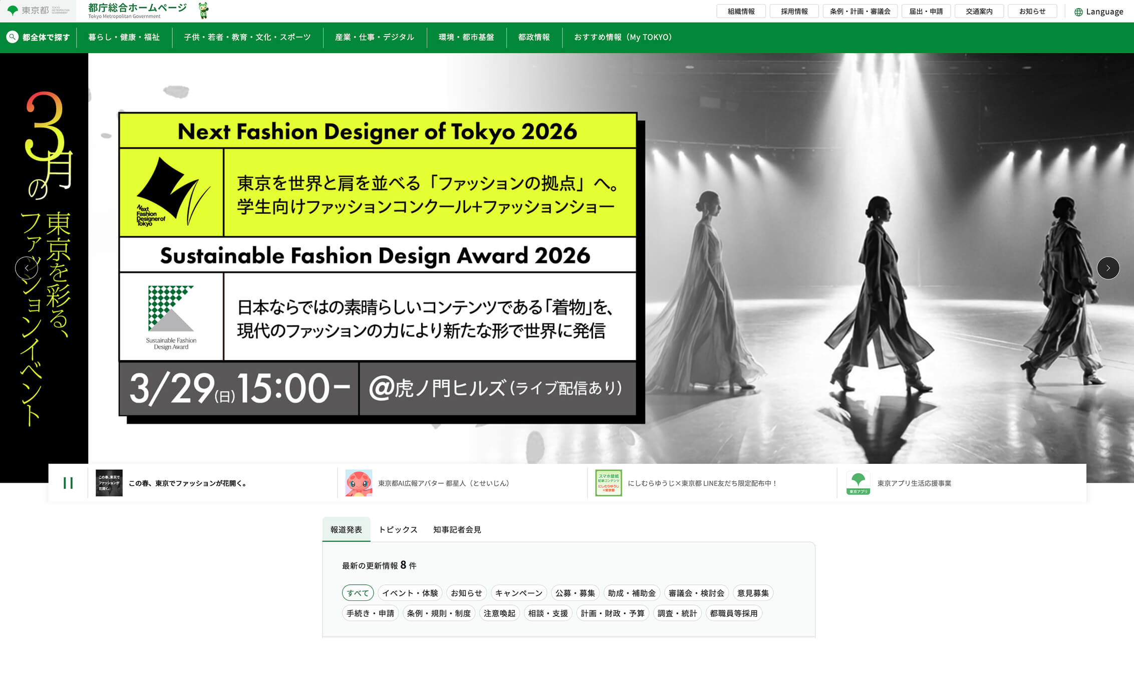
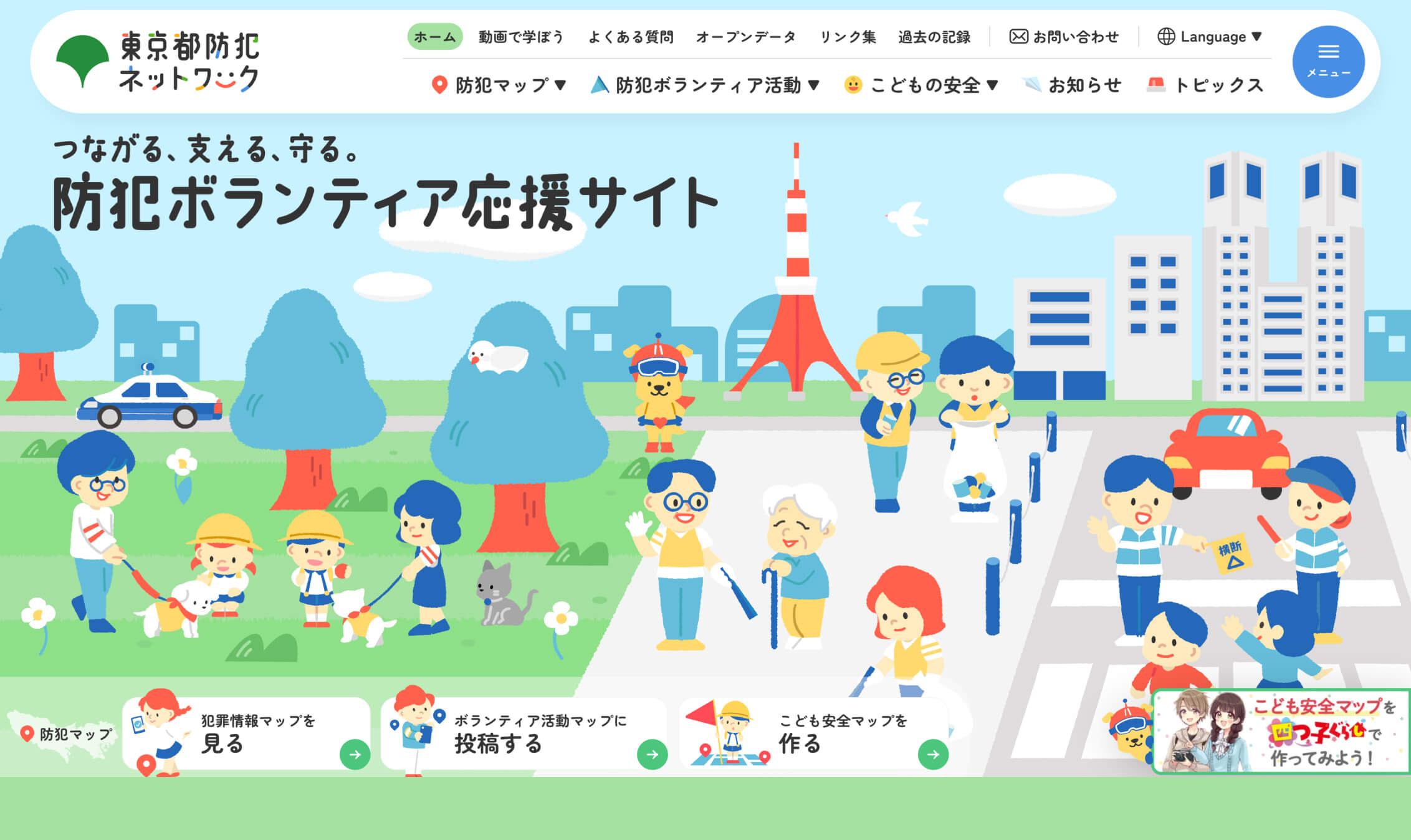
Examples that reflect this omotenashi-driven restraint can be seen in public-sector interfaces such as the Tokyo Metropolitan Government and the Tokyo Metropolitan Crime Prevention Network. In both cases, the interaction patterns prioritize clarity, predictable structure, and quiet reassurance over visual spectacle.
Microinteractions That Reduce Friction (Rather than Add Delight)
Microinteractions in Japan are often designed as quiet support. They exist to prevent small mistakes, clarify next steps, and reduce uncertainty during moments that would otherwise cause hesitation.
Common patterns tend to follow a practical, low-drama logic:
- Inline validation stays out of the way: feedback appears where the user is already looking, rather than escalating into disruptive error states.
- Form guidance is gentle and specific: hints and constraints help users succeed on the first attempt without feeling warned or scolded.
- Defaults reflect the moment: prefilled choices and states reduce effort when context is clear, without taking control away.
- Progress cues reassure, not celebrate: indicators confirm that the user is on track without turning completion into a performance.
The message is not “look how delightful this is.” It is “you are on track.”
What is deliberately avoided matters as much as what is added. Many Japan-facing interfaces minimize over-animated success states, playful but ambiguous interactions, and emotional manipulation disguised as “delight.” Even when motion is present, it is typically functional, reserved for orientation, confirmation, or reducing perceived waiting.
This is why the best microinteractions go unnoticed. They do their job quietly, so the user does not have to stop, interpret, or recover.
Emotional Ease as a Design Goal
A useful way to understand Japanese microinteractions is to treat emotional ease as a design outcome. Many experiences are designed to feel calm and predictable, giving users a sense of being “looked after” not through overt friendliness, but through consistent behavior and fewer chances to make mistakes
When this is done well, users feel competent rather than managed. Errors feel less intimidating and easier to recover from, and the interface feels considerate rather than controlling. That distinction can be subtle, but it changes whether the user trusts the system enough to continue.
This matters most when the experience is complex or consequential. Civic services, travel planning, and multi-step or form-heavy workflows benefit from interfaces that quietly prevent mistakes and reduce anxiety. In these contexts, the “wow factor” is that the user completes the task smoothly, without encountering friction that forces them to start over.
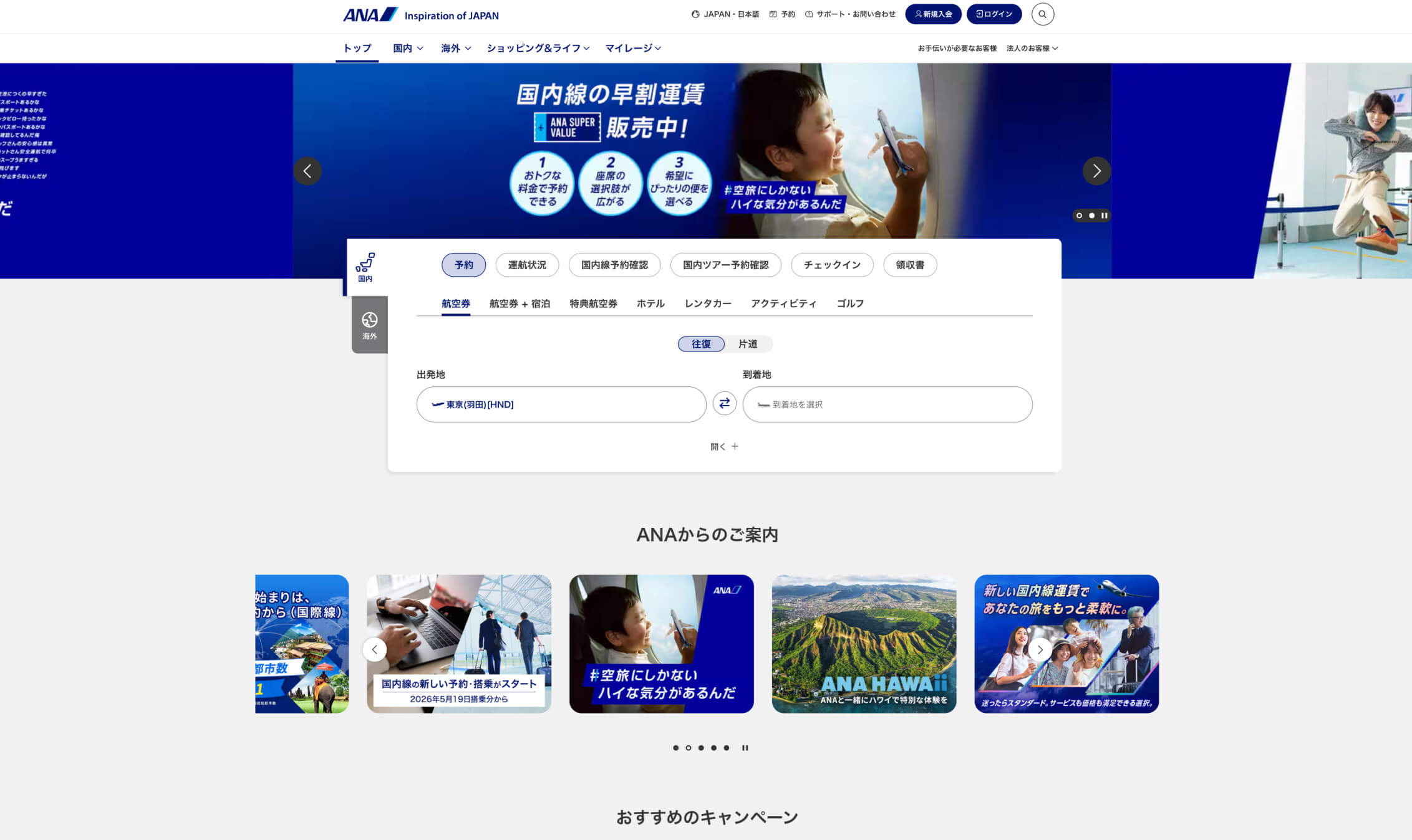
Travel and booking ecosystems such as JTB, ANA, and the JR East Travel Service Center demonstrate how this style of UX support operates in practice. These platforms handle complex, time-sensitive workflows while maintaining a sense of calm continuity across multi-step processes.
Implications for Design Teams
For design teams, omotenashi-driven UX changes how quality is measured. It suggests that UX quality is often defined by the absence of friction, not the presence of spectacle.
It also raises the bar for microinteraction design. Getting these “small” moments right depends on strong content design, thoughtful handling of edge cases, and close designer–engineer collaboration. The details often show up in the small, easy-to-overlook moments, including form behavior, error prevention, default values, and how the interface responds when users do something unexpected.
There is also an organizational implication. Teams need time to design “boring” moments well, and polished defaults often matter more than feature launches. In Japan-facing products, the path to differentiation often runs through reliability, and reliability is built in the microinteractions.
Trend 2: Subtle Personalization and Adaptive UX
Intelligence That Does Not Announce Itself
Ways Overt Personalization Can Backfire in Japan
Personalization in Japan avoids overt signals of automation or intelligence. Many users appear cautious about explicit references to AI, and about systems that state how much they know about the user.
When personalization is too visible, it can trigger discomfort. It can feel like surveillance, break trust, or create anxiety instead of convenience. Even simple recommendation messaging can backfire if the interface implies that the system is tracking more than the user expects.
The resulting design stance in 2026 is pragmatic. Intelligence should feel appropriate, not impressive. The interface should support the user’s situation without making the mechanism behind that support the center of attention.
Adaptive UX Without Explanations or Labels
In Japan, personalization often appears as adaptive UX that does not announce itself. The interface shifts in small ways that feel situational, and the user is not asked to treat those shifts as a feature.
Common adaptations are often simple, but carefully timed:
- Content order shifts quietly: what is most relevant now rises to the top, without calling attention to the change.
- Recommendations feel situational: suggestions appear as helpful options, not as predictions the system wants to prove.
- Navigation emphasizes what matters now: key paths become easier to reach when timing or context makes them more likely.
Crucially, the interface often does not explain why it adapts. There are fewer “because you liked X” banners and fewer explicit labels that frame the experience as algorithm-driven. Instead, the experience simply feels timely, and the user does not need to understand why something appears in a given moment.
This aligns with high-context communication norms and a preference for implication over declaration. The interface behaves more like a well-timed service layer than a system constantly explaining itself.
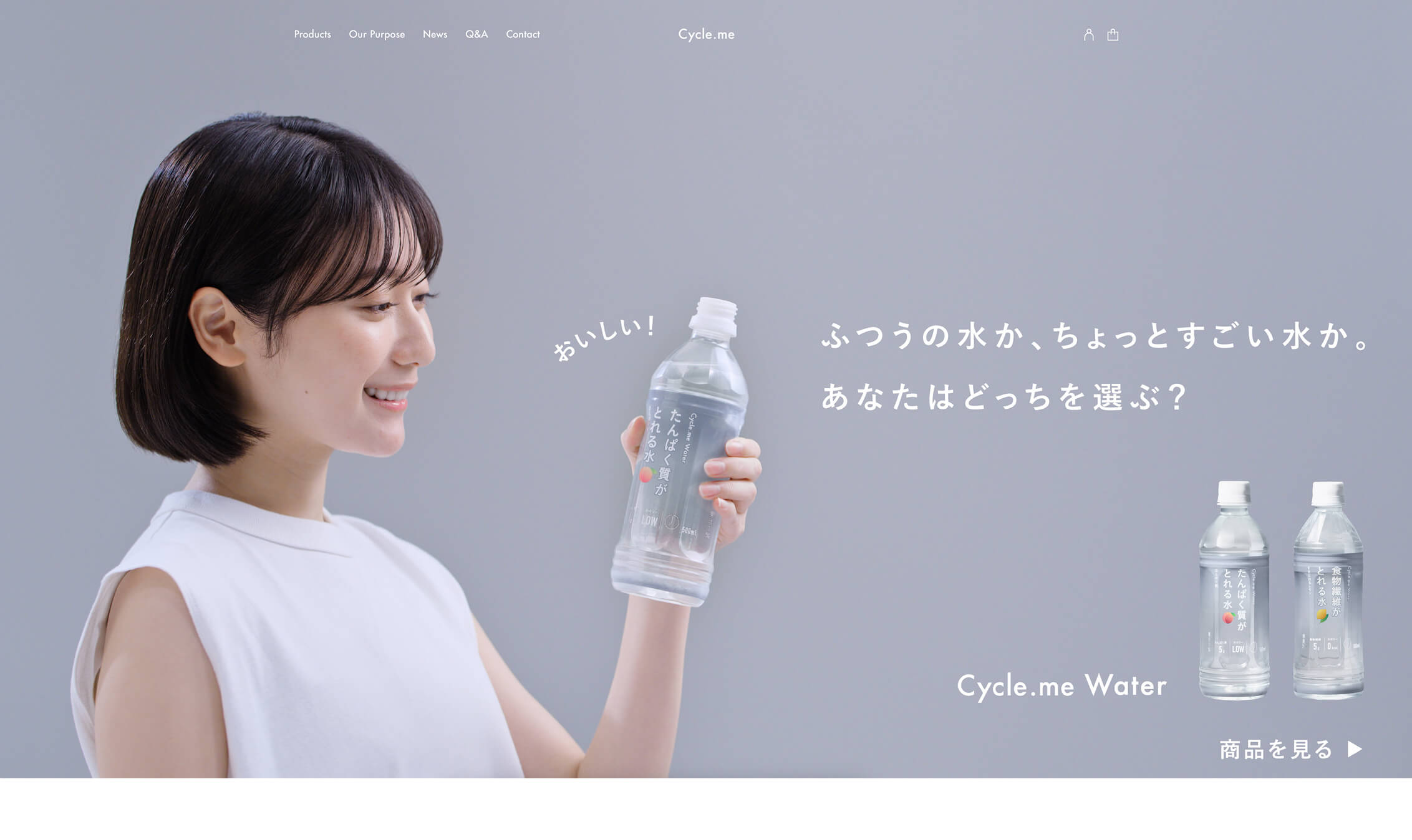
Examples that reflect this approach include Cycle.me and Marunouchi.com, where adaptive content hierarchy and situational emphasis feel appropriate to the moment rather than algorithmically announced.
Context Over Identity
A defining characteristic of subtle personalization in Japan is that context often outweighs identity. Rather than relying heavily on explicit profile data, many experiences prioritize situational signals such as time, device, location, or the user’s most recent actions. For example, a service may surface booking-related actions near departure time or emphasize mobile-friendly shortcuts when the user returns on a phone.
This approach can feel less invasive because it does not require the user to trust the system with deep personal data upfront. It can still deliver relevance, but it frames that relevance as situational awareness rather than overt personalization.
Where This Shows Up Most Clearly
Subtle adaptation is particularly effective in domains where users return often, contexts change frequently, and the cost of friction is high.
Travel and transportation experiences benefit because urgency and timing are central, and because users often move between planning and action. Retail ecosystems benefit because inventory, promotions, and intent shift quickly. Platform-style services benefit because the user’s goals can be diverse within the same product. Daily-use apps benefit because repeat engagement creates patterns that can be supported without requiring explicit explanation.
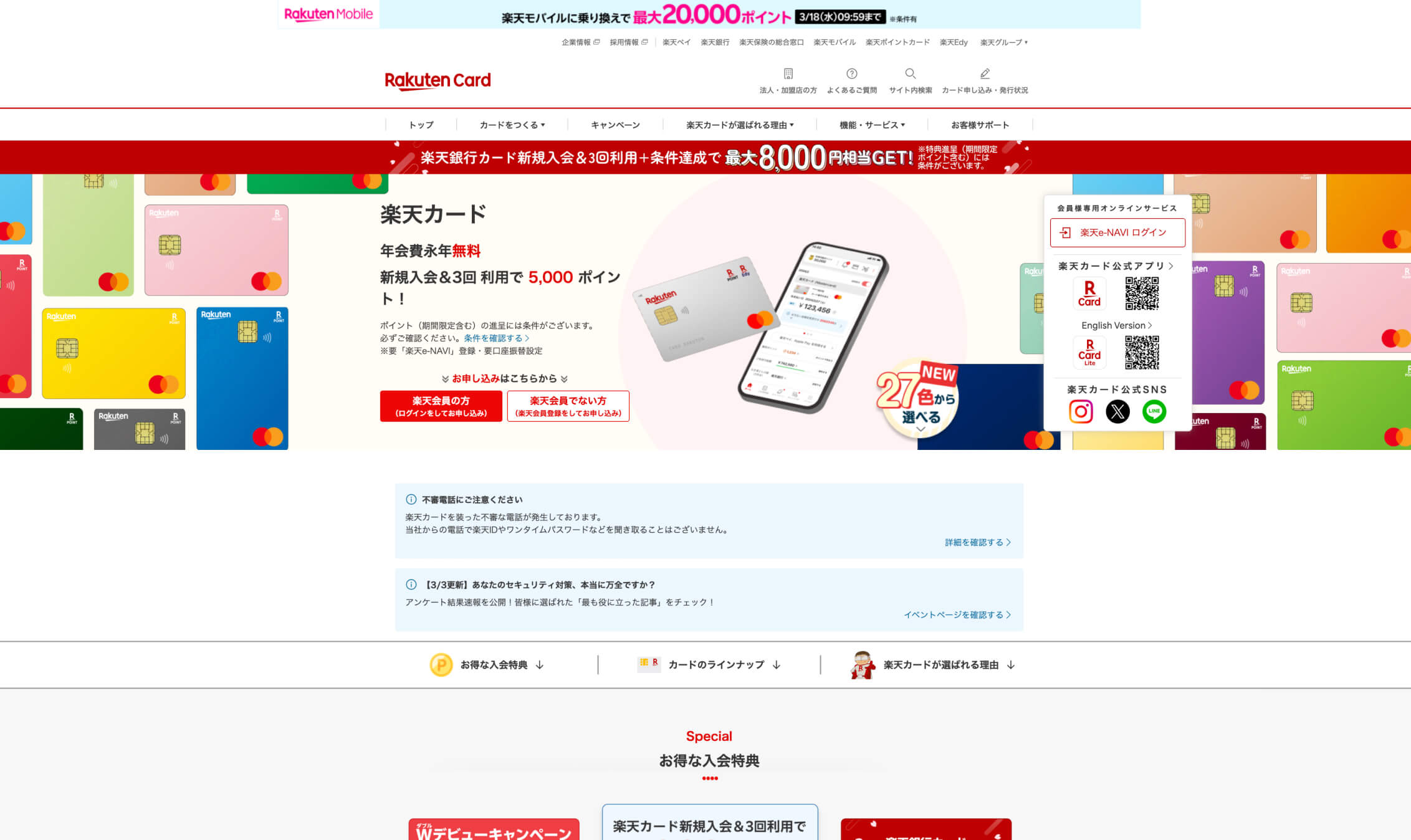
Subtle adaptation is also visible in the websites for widely used platforms such as Rakuten Card, Mercari, and LINE. In each case, interface adjustments often reflect context and timing without explicitly labeling themselves as personalization features.
Design and Ethical Implications
Subtle personalization has both design and ethical implications in 2026.
One key point is that transparency does not always mean explanation. Some products build trust not by narrating every decision, but by behaving consistently and by avoiding interactions that make users feel watched. Restraint can be a form of transparency when it signals that the system is not trying to extract attention.
Another point is that good personalization can feel like good information architecture and timing. The best adaptation often looks simple on the screen, but it requires strong product judgment to decide what to emphasize, when to change ordering, and how to avoid sudden shifts that feel arbitrary.
Poorly executed subtlety looks like randomness. If adaptation is inconsistent, unexplained, or overly sensitive, users may feel that the interface is unpredictable rather than considerate. In Japan-facing UX, the tolerance for that kind of uncertainty is often low, which raises the bar for consistency, testing, and long-term iteration.
A Shift in Japanese Values Around User Experience
Taken together, omotenashi-driven microinteractions and quiet adaptive UX point to a deeper shift in Japanese UX values in 2026.
Both trends prioritize appropriateness over expressiveness, care over charisma, and calm confidence over novelty. They also reinforce the same underlying goal: reduce uncertainty without demanding attention. In that sense, these patterns are less about style and more about how the interface behaves during everyday moments.
This also connects back to Part 1. Structural clarity enables subtle behavior, because users can only feel “quiet intelligence” when the interface is already predictable. Performance and stability create the space for microinteractions and adaptation to feel supportive rather than distracting.
Japanese UX maturity in 2026 often looks like fewer visible “features,” but more reliable feelings. The experience does not constantly prove itself. It simply keeps working.
What International Teams Often Miss
For international teams, the subtlety of Japanese UX can be easy to misread.
Common misconceptions include assuming that nothing is happening visually, that the design is conservative, or that personalization is weak. In reality, the sophistication is often behavioral rather than visual, and the intelligence is implicit rather than branded.
The ambition in these experiences is emotional steadiness, not engagement spikes. If users feel calm, confident, and uninterrupted, the design is working, even if the interface does not advertise its decisions.
Closing: Intelligence That Stays Out of the Way
Japanese UX maturity in 2026 is increasingly defined by what the interface chooses not to do. Rather than announcing its intelligence through animation, personalization signals, or feature highlights, the experience quietly removes friction and uncertainty as users move forward.
For designers and product teams, the lesson is that subtlety is not a lack of ambition. It is a disciplined approach to UX that prioritizes emotional ease, predictability, and long-term trust. In Japan’s digital ecosystem, the most effective interfaces are often the ones users barely notice — because everything simply works.
For organizations planning Japan-facing products or redesigns, translating these principles into real UX decisions requires both local insight and strong technical execution. Netwise helps teams design and build digital experiences that meet these expectations while remaining scalable and maintainable over time.
This article is the second in a three-part series on Japanese web design trends in 2026. In the final installment, we will shift from interaction patterns to brand expression more broadly, looking at how Japanese brands build trust not only through usability, but through continuity and consistency over time. Specifically, we will explore how purposeful nostalgia helps brands preserve recognition and emotional continuity, and how design systems are increasingly becoming the foundation of scalable, trustworthy digital identity.