Introduction: From Subtle UX to Enduring Brand Identity
Part 1 of this series focused on structural maturity in Japanese web design in 2026, including performance, accessibility, and information design. Part 2 shifted to behavioral maturity, looking at omotenashi through microinteractions and adaptive UX that feels intelligent without announcing itself.
Part 3 turns to a different, but closely related question. In 2026, Japanese web design maturity is not only about how interfaces function. It is also about how brands stay recognizable and trustworthy across websites, apps, and services. For many organizations, the challenge is no longer “How do we look modern?”, it is “How do we update the experience without losing what makes us feel like us?”
Two patterns help explain how brands create that stability. Purposeful nostalgia uses familiar cues to signal continuity and reliability. Design systems make identity easier to repeat at scale, because teams can reuse the same interface elements and interaction patterns across touchpoints.
Together, these trends show how Japanese brands can evolve without constantly reinventing themselves. The goal is not to look new every time a site is updated, rather, it is to stay familiar and dependable as the brand changes over time. This article looks at how that trust is built through recognizable brand cues and consistent design patterns across pages and products in Japan in 2026.
Why Personality and Identity Matter Differently in Japan in 2026
Before naming the trends, it helps to clarify why identity is being handled differently in Japan in 2026.
- Digital aesthetics are converging: as global design patterns become more standardized, interfaces can start to feel interchangeable. Continuity stands out because it is recognizable.
- Trend cycles move quickly: brands still need to modernize for performance and accessibility. However, abrupt reinvention can weaken trust by breaking familiar cues.
- Scale requires governance: large organizations need identity to hold up across channels, teams, and products. That is why consistency increasingly comes from shared interface patterns and repeatable structures, not only brand guidelines.
Strong brand expression does not always come from novelty; it can also come from careful repetition, familiar cues, and disciplined systems. In Japan in 2026, these conditions make personality in web design less about expressive change and more about continuity, coherence, and trust.
Trend 1: Purposeful Nostalgia as Brand Continuity
Familiarity Used Deliberately, Not Decoratively
Nostalgia as a Trust Signal, Not a Retro Aesthetic
Nostalgia continues to matter in Japanese design, but its use in 2026 is more deliberate. Rather than relying on retro references for novelty, brands use familiar visual language to signal reliability, history, and emotional continuity.
The core idea is simple. The goal is not to look old, but to feel established, recognizable, and trustworthy. Nostalgic cues act as trust signals, especially when users are making quick judgments about whether a brand feels legitimate, safe, and consistent with what they remember.
This works because familiarity lowers perceived risk. Continuity helps brands feel stable against fast-changing global design trends. Long-standing brands can treat memory as part of their identity rather than something to erase. In Japan, where longevity often carries positive meaning, familiar cues can communicate seriousness and endurance without requiring louder expression.
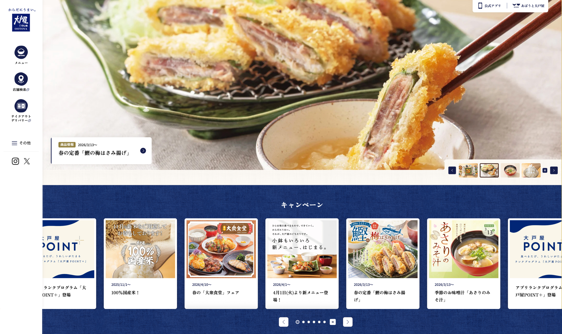
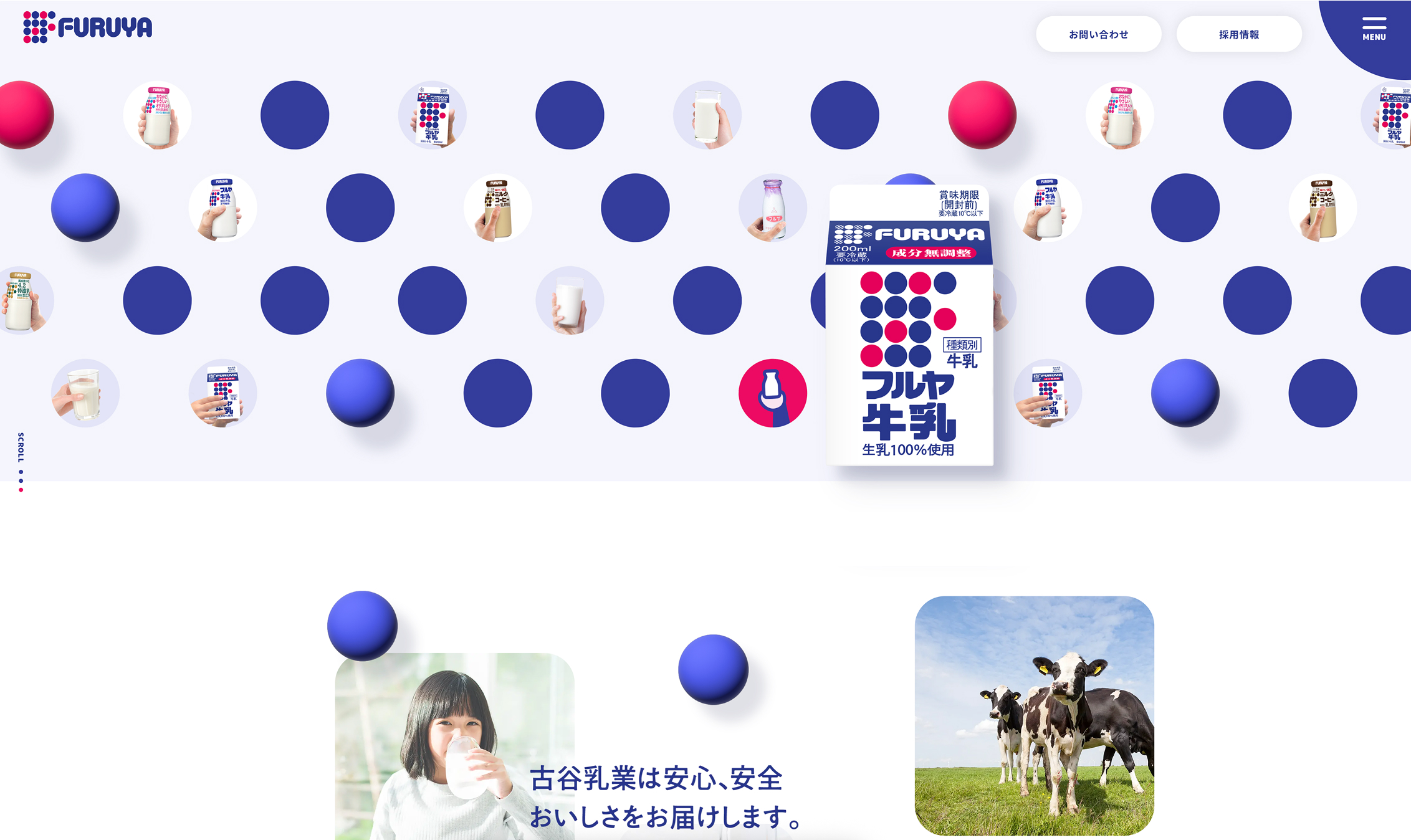
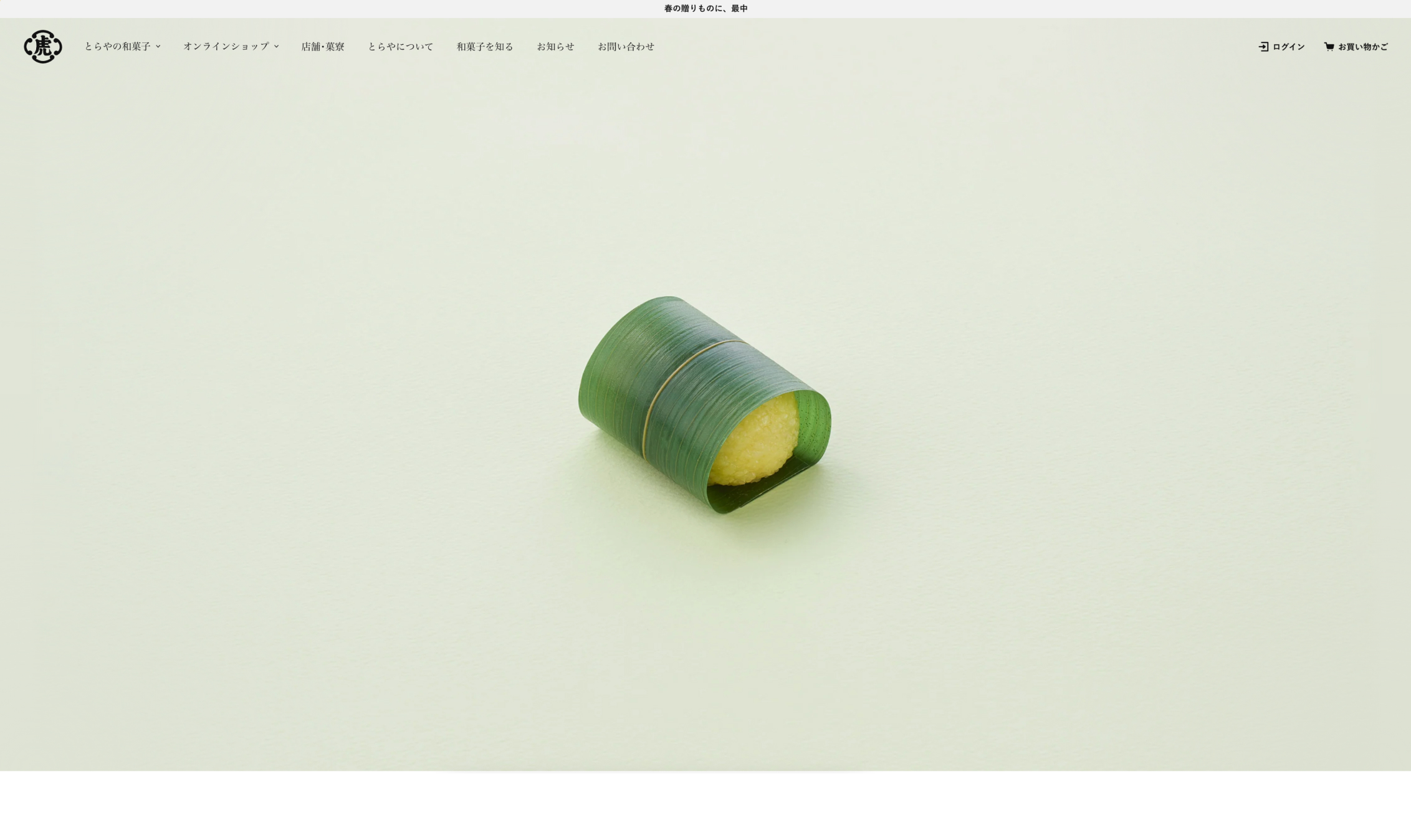
This approach is visible in brands such as Ootoya, Furuya Milk, and Otsuka Pharmaceutical, where familiar visual cues reinforce continuity and trust.
How Purposeful Nostalgia Appears in Japanese Web Design
Purposeful nostalgia in 2026 rarely appears as a fully retro website. It tends to be selective and controlled, using familiar cues to create emotional grounding while keeping the experience current, readable, and responsive.
Common expressions include heritage-oriented typography, colors or layouts that echo familiar packaging, and older brand cues adapted for digital use. Many brands also use editorial, illustrative, or product storytelling to emphasize lineage and continuity. The aim is to make history feel like part of the living brand, not like something preserved behind glass.
That distinction matters because these experiences are not trying to recreate the past, they are trying to preserve recognition while updating everything that needs to work well on today’s web. The result is often a brand that feels rooted rather than trend-driven, and an interface that communicates confidence through continuity.
Where This Trend Appears Most Clearly
Purposeful nostalgia appears most clearly in categories where brand history already carries value. Food and beverage, household and consumer goods, and other long-standing brands with intergenerational recognition often benefit from continuity because familiarity is part of what users are buying.
These sectors fit especially well because emotional continuity reinforces trust. Users often associate longevity with quality and legitimacy, and familiar cues can signal that the brand remains itself even as digital experiences evolve. This pattern is also especially visible in long-established consumer brands such as Suntory and Toraya.
Why This Matters More in 2026
As more digital experiences begin to look interchangeable, continuity becomes a stronger differentiator. Familiarity can help brands feel distinct without requiring louder visual expression, because the difference comes from recognition rather than novelty.
There is also a cultural and emotional dimension. In the context of Japanese brands, continuity often signals care and seriousness. It can suggest that the organization is not chasing attention at the expense of stability. Nostalgic cues can make a brand feel dependable rather than outdated, especially when they are paired with modern performance, clearer structure, and accessible typography.
The key takeaway is that purposeful nostalgia is not resistance to change. It is a controlled way of evolving without breaking emotional recognition, and it can help brands modernize while preserving the trust signals that matter most.
Implications for Brand and Design Teams
For brand and design teams, purposeful nostalgia reframes heritage as a usable asset rather than a constraint. The practical question is which cues are essential for recognition, and which parts of the digital experience can be improved without weakening trust.
Two distinctions matter in Japan-facing work. Teams need to separate valuable familiarity from genuinely outdated execution, and they need to calibrate updates rather than assume reinvention is required. A brand can keep its recognizable language while still improving clarity, responsiveness, accessibility, and content structure.
The design challenge is to preserve trust signals while increasing digital relevance. When teams treat nostalgia as a controlled tool, they can modernize the experience without erasing what the brand means to returning users.
Trend 2: Design Systems as the Foundation of Visual Identity
Consistency as a Brand Expression Tool
From Individual Projects to Long-Term Systems
More Japanese companies are treating their digital presence as a long-term system rather than a series of standalone projects. As organizations manage multiple sites, apps, and services, design systems are becoming one of the main ways to keep brand identity consistent across touchpoints.
Identity is no longer maintained only through visual guidelines. It is also maintained through shared layouts, interface elements, and interaction patterns, so different teams can build new pages and features while still making them feel like they belong to the same brand.
This matters more in 2026 because scale, consistency, and governance have become central to brand trust. As digital ecosystems grow, inconsistency can make an organization feel fragmented, and that fragmentation can read as risk.
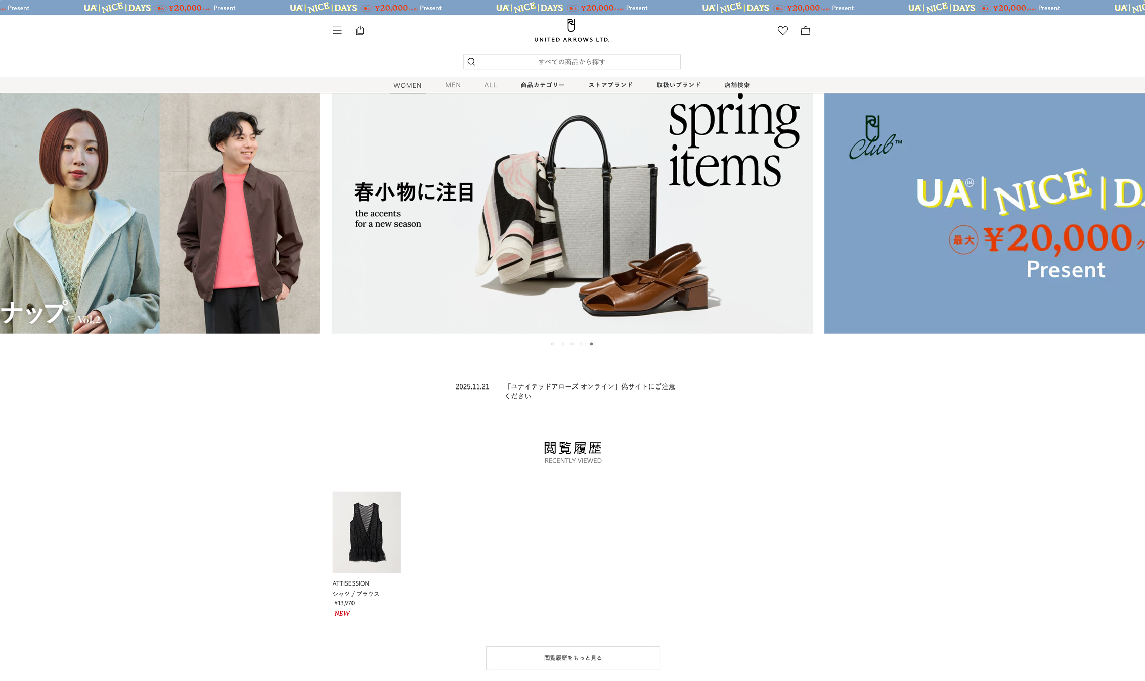
This system-led approach is visible in brands such as UNITED ARROWS LTD., where consistency across layouts, interface elements, and content structure strengthens brand identity over time.
Design Systems as Brand Infrastructure
Design systems are often framed as productivity tools. In 2026, they will also function as brand infrastructure. They shape what the brand looks and feels like every time a user visits, not only on a single page or campaign.
A strong system covers more than colors and logos. It sets practical rules for typography, spacing, layouts, and core interface elements such as buttons, forms, and navigation. It also keeps those rules consistent across pages, products, and devices.
In 2026, strong visual identity is closely tied to that consistency. A brand feels professional not only because of how it looks, but because the experience works in familiar ways across touchpoints, with recognizable navigation, predictable interface elements, and clear information structure.
Why Restrained Interfaces Can Feel Stronger Over Time
System-driven design can appear visually restrained or understated, and that restraint is sometimes misread as a lack of personality. In practice, it can create a stronger identity over time because repetition builds recognition and trust.
Coherent systems also make large digital ecosystems feel unified and dependable. Users learn what the brand feels like, not only what it looks like, because the same logic shows up across pages, flows, and services.
This is not about reducing creativity — it is about making identity durable, scalable, and easy to recognize across contexts, so what makes the brand distinct stays consistent rather than fragile.
Where This Shows Up Most Clearly
System-led identity is most visible in contexts where scale and complexity make one-off design approaches difficult to sustain. Retail groups, enterprise and technology brands, large corporate ecosystems, and organizations managing multiple sites or services benefit because systemization reduces fragmentation.
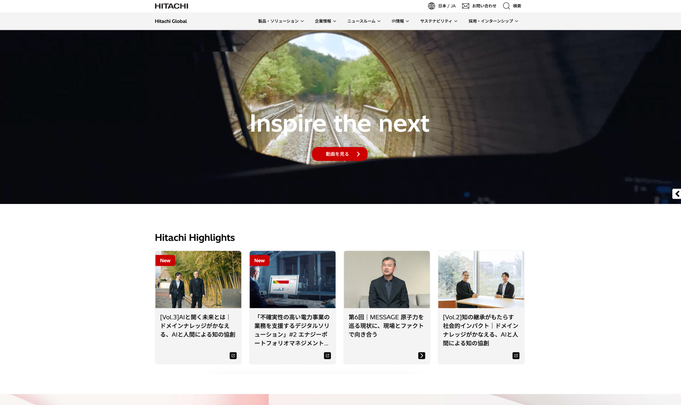
This pattern is especially visible in brands such as Hitachi and Toyota, where strength comes less from dramatic interface variety and more from consistency, clarity, and repeatable interface rules across experiences.
Strategic and Organizational Implications
For 2026 teams, design systems increasingly function as brand assets, not only production assets. That changes both what systems need to include and how teams need to maintain them.
Governance and maintenance become essential to preserving identity over time. Strong systems support scale without diluting brand character, but only when teams keep interface elements aligned, handle exceptions carefully, and update patterns without creating confusion.
The design challenge is to express personality through reusable rules and interface elements. The goal is not just consistency but consistent distinctiveness, so the brand stays recognizable even as the system grows.
How These Two Trends Reflect a Deeper Shift in Japanese Brand Expression
Purposeful nostalgia and design systems can seem unrelated, but in 2026 they often support the same goal. Both help brands evolve in a controlled way, without constantly reinventing how they look and feel.
They also solve two sides of the same problem. Purposeful nostalgia helps users recognize the brand and feel its history. Design systems help teams keep that identity consistent as websites, apps, and services expand.
Together, they help brands feel stable, recognizable, and trustworthy. The larger point is that Japanese digital identity in 2026 is increasingly built through careful change, updates that improve relevance without weakening recognition.
Conclusion: Personality Through Continuity, Identity Through Systems
Japanese web design in 2026 suggests that strong digital identity does not have to rely on dramatic change. Brands can express personality through familiarity, continuity, and carefully maintained systems, and those choices often strengthen trust rather than limiting creativity.
The most durable digital identities are often the ones that evolve carefully, remain recognizable, and create trust through coherence over time. In Japan, that coherence can be emotional, through purposeful nostalgia. It can also be operational, through systems that keep brand expression consistent across touchpoints.
Across all three parts, Japanese web design in 2026 points toward a broader definition of maturity. There is less emphasis on spectacle and more emphasis on trust, appropriateness, and long-term clarity. For teams planning Japan-facing experiences, these are not just design preferences. They shape how a brand is understood over time. Netwise helps organizations turn those principles into digital experiences that feel clear, consistent, and credible in the Japanese market.