Introduction: 2026 as a Year of Refinement, Not Reinvention
Japanese web design in 2026 is not defined by a new visual style. Instead, it reflects a tightening of priorities around how websites perform, read, and function for real users.
After several years of experimentation with bolder visuals and heavier motion, many Japanese teams are now pulling back. The focus is shifting toward clarity, responsiveness, and structural consistency, letting the fundamentals of UX do more of the work than expressive visuals or attention-grabbing effects.
This change is less about aesthetics and more about values. Performance, accessibility, readability, and information structure are increasingly treated as core design responsibilities, not secondary considerations. These factors now shape interface decisions as much as color, layout, or motion.
In that sense, 2026 marks a point of maturity. Japanese design is not trying to stand out through novelty, but to earn trust through consistency, intent, and ease of use.
This article is the first in a three-part series examining how these priorities are shaping Japanese web design today. Across the series, we will explore the underlying trends and highlight recent examples from the Japan Web Design Gallery to show how these ideas are appearing in live, production websites.
The Broader Context: Why These Shifts Are Happening Now
Japanese digital experiences in 2026 are shaped less by visual ambition and more by practical constraints. Teams are designing for broader audiences, longer product lifecycles, and systems that need to remain usable and maintainable over time.
Demographics are a major factor. According to the Japanese Cabinet Office’s Annual Report on the Ageing Society (FY2024), 29.1% of Japan’s population was aged 65 and over as of October 1, 2023. This reality makes inclusive defaults, readable typography, and predictable interaction patterns essential design decisions rather than optional enhancements.
At the same time, many organizations are moving away from one-off redesigns toward design systems that can be updated and governed long-term. This shift reduces tolerance for visual excess that adds cost or complexity without delivering clear UX value. In practical terms, Japanese teams are prioritizing stability over trend-chasing, predictability over surprise, and usability over expression.
The three trends that follow reflect responses to these constraints, not stylistic preferences.
Trend 1: Calm, Performance-Focused Design as a Core UX Value
Performance as a Design Constraint, Not Just a Technical Metric
In 2026, performance in Japan is increasingly treated as part of the design brief, not only an engineering concern. That is why more Japanese teams are actively avoiding patterns that are expensive in load time or heavy in runtime, especially when the payoff is mainly decorative.
This includes heavy animations, overly complex transitions, and visual effects that look impressive but do not improve understanding, navigation, or conversion.
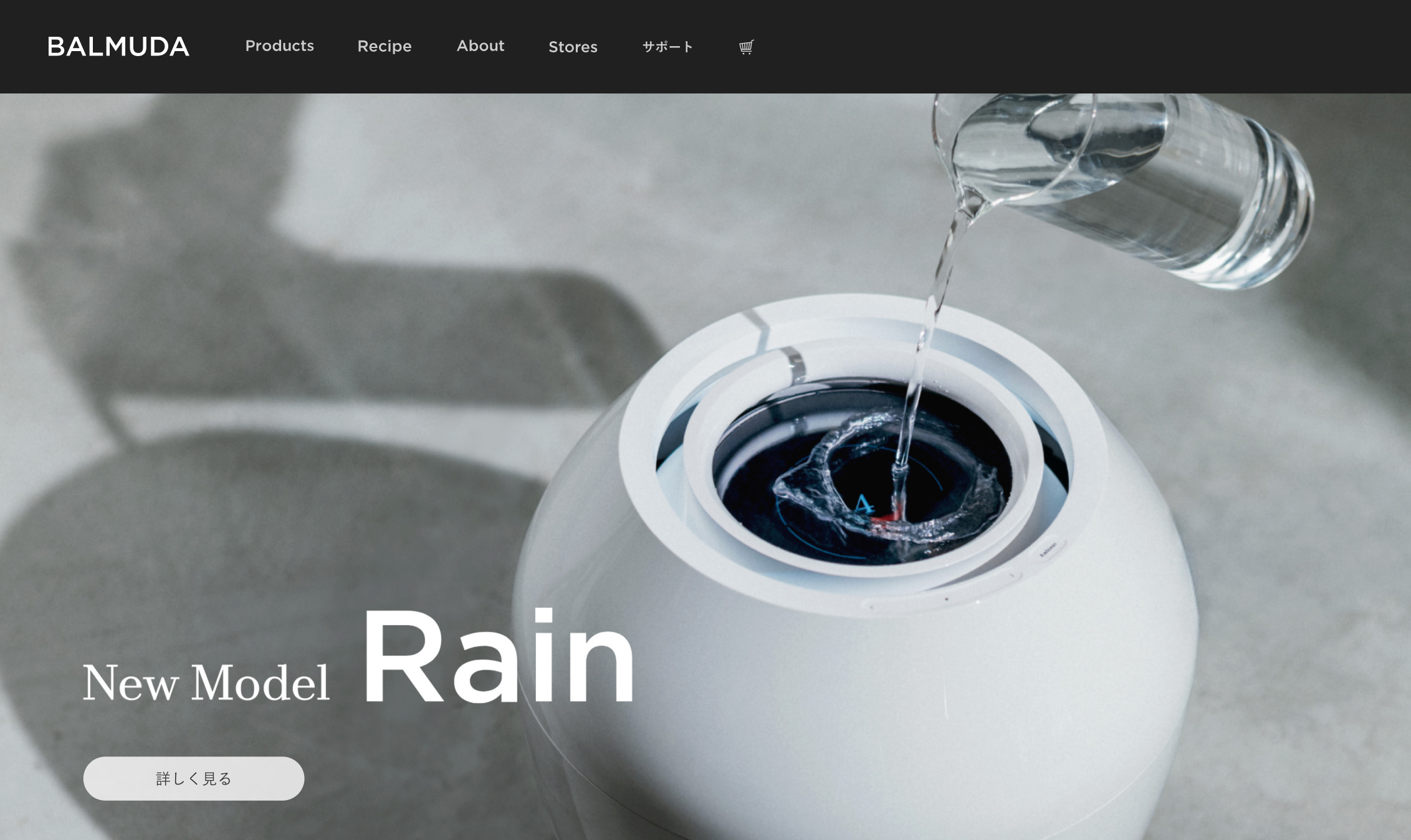
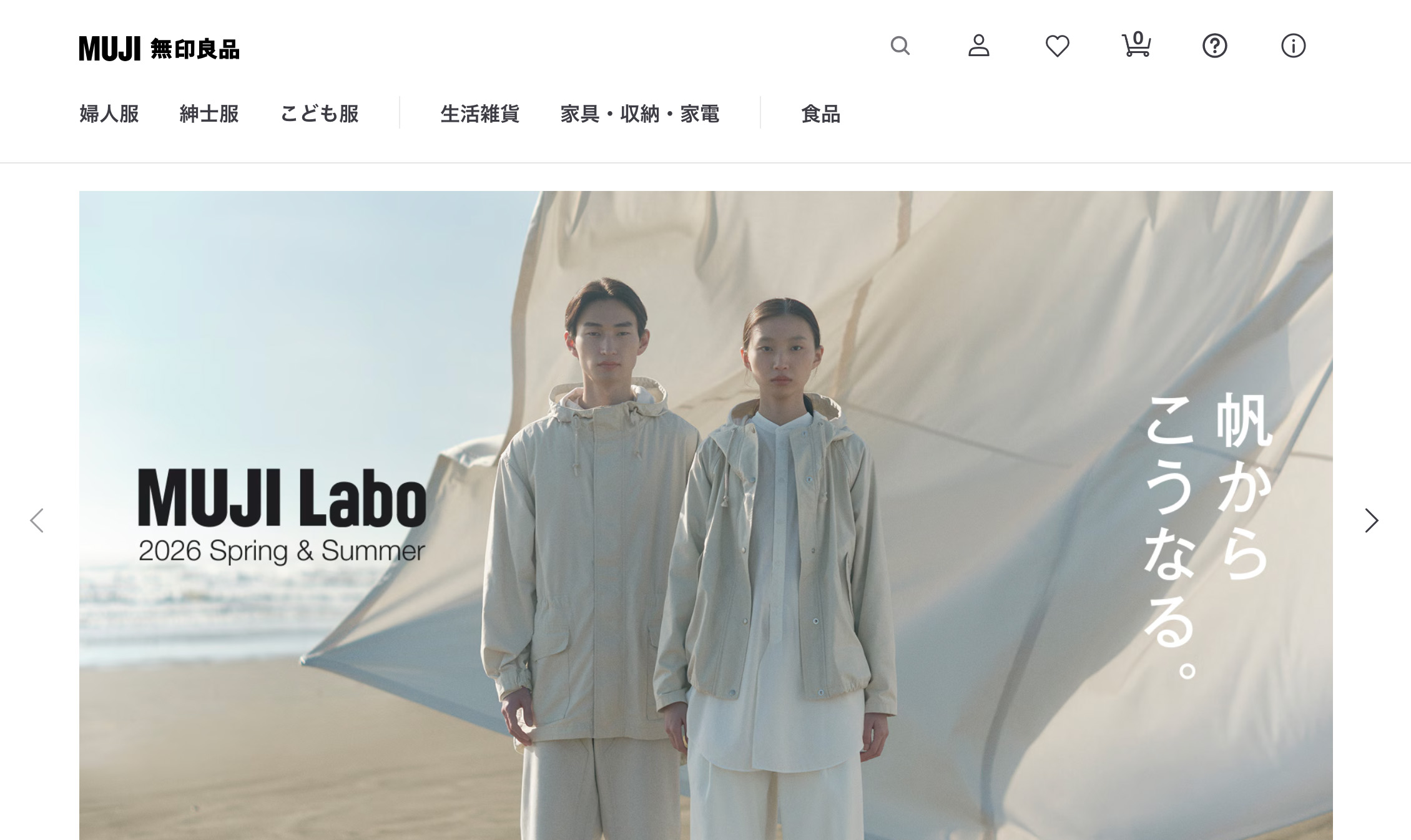
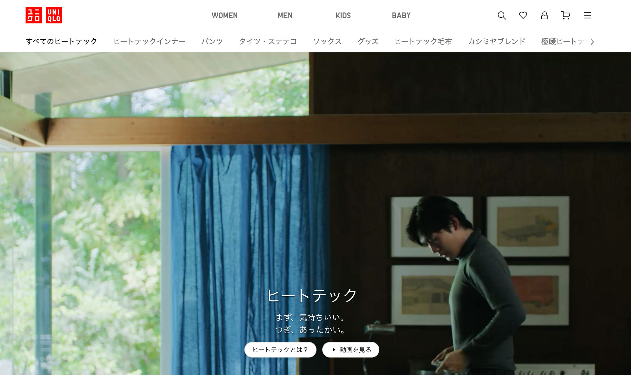
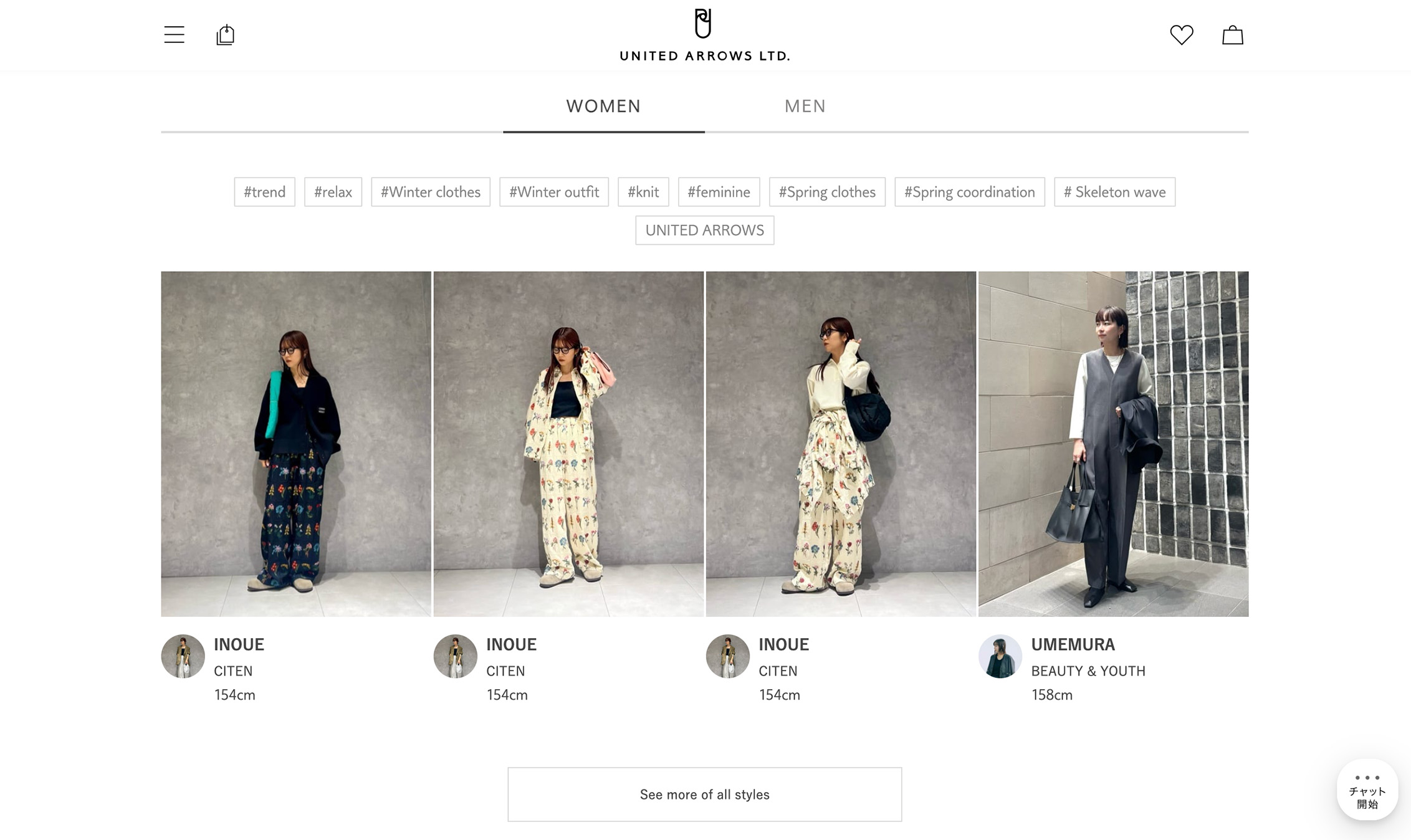
Google’s Core Web Vitals framing has helped make this mindset easier to communicate across teams, because it translates performance into user experience signals like loading, interactivity, and visual stability. Examples that reflect this calmer, performance-aware direction can be seen in Japan Web Design Gallery references such as BALMUDA and UNITED ARROWS LTD. Similar restraint also shows up in large, high-traffic ecosystems like MUJI, SMBC, and UNIQLO.
The Rise of “Quiet Interfaces”
As performance becomes a design constraint, a related pattern becomes more apparent: the rise of quiet interfaces. The goal is to remove anything that competes with the user’s task, especially when it adds weight without improving comprehension.
Quiet interfaces are visually restrained, predictable in behavior, and focused on clarity rather than engagement tricks. In practice, that means motion is used sparingly and mainly for orientation, layouts lean on consistent spacing and typography, and transitions avoid surprises so users can move through the site without re-learning patterns.
Why This Matters in the Japanese Context
Efficiency matters in Japanese digital experiences, but not in a purely technical sense. Efficiency also means that an interface feels polite, it does not interrupt the user, demand attention unnecessarily, or add friction for the sake of brand theater.
Non-intrusiveness is a form of UX respect. Users often value interfaces that do not ask them to admire the design, and the best experiences feel like they “get out of the way,” while still offering enough guidance to prevent mistakes.
Implications for Designers and Teams
Design success in Japan is measured less by visual impact and more by load perception, interaction smoothness, and cognitive calm. When an interface feels stable and responsive, users often read that as professionalism. This also changes collaboration, because performance budgets increasingly become part of design thinking, and designers may need to weigh the cost of motion, type rendering, media formats, and component complexity earlier in the process.
Trend 2: Accessibility and Readability as a Standard, Not a Feature
Accessibility as a Baseline Expectation
Accessibility in Japan is increasingly viewed as a baseline expectation and a sign of professionalism. Many teams approach it as a core part of delivering a reliable experience, not an optional layer added late.
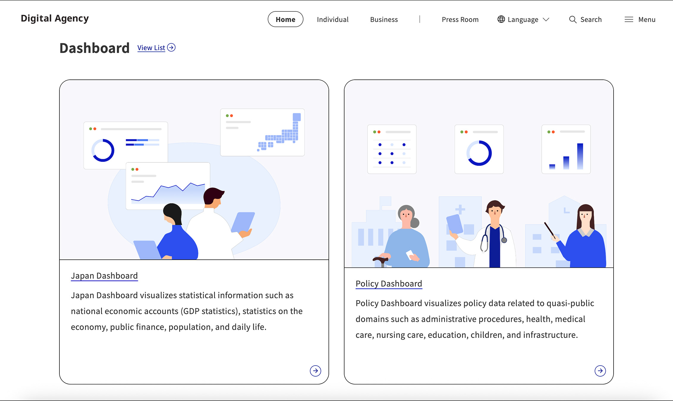
In practice, accessible defaults function as UX hygiene. They reduce risk for organizations that serve broad audiences with varied needs, devices, and levels of digital comfort. Public-sector influence is a major reason. The Japanese government has been increasingly explicit about accessibility commitments, including at the agency level. For example, the Digital Agency publishes its approach and references using the Japanese Industrial Standard for web accessibility in its accessibility statement.
Typography as Structural Infrastructure
Japanese interfaces rely heavily on text as the primary information carrier. Even when visuals are strong, the interface often depends on written detail to explain options, set expectations, and guide decisions.
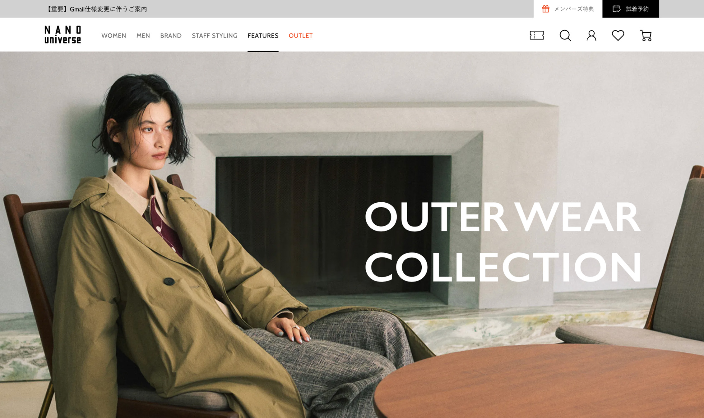
Typography creates hierarchy, establishes rhythm, and supports long reading and scanning sessions. Because font size, spacing, and contrast shape whether dense information feels approachable or exhausting, Japanese teams often treat typographic rules as structural infrastructure. They pay close attention to line spacing, paragraph rhythm, and heading behavior in multi-level navigation so text functions as navigation, not just content. This is visible across many Japan Web Design Gallery references, including UNITED ARROWS LTD. and nano universe, where typographic structure helps users move through complex content without feeling lost.
Designing for Dense Information Without Fatigue
Japanese sites often handle long-form explanations, detailed instructions, and multi-level navigation, which is why readability is treated as a core UX capability rather than a cosmetic concern.
When users want confidence, they often want detail. Readability makes that detail usable by clarifying what content is for, what belongs together, and what matters most, so pages support scanning, pausing, and returning later.
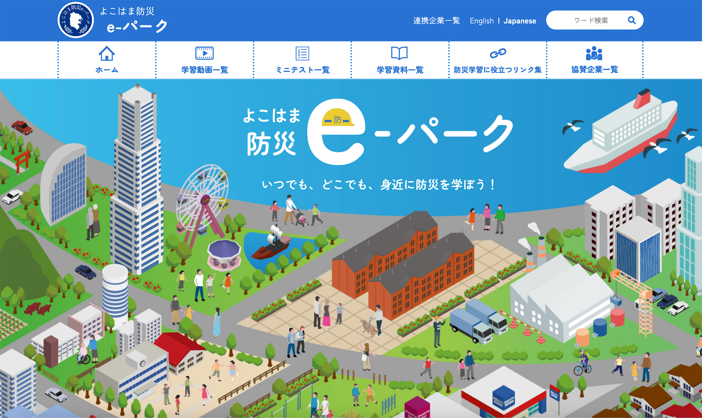
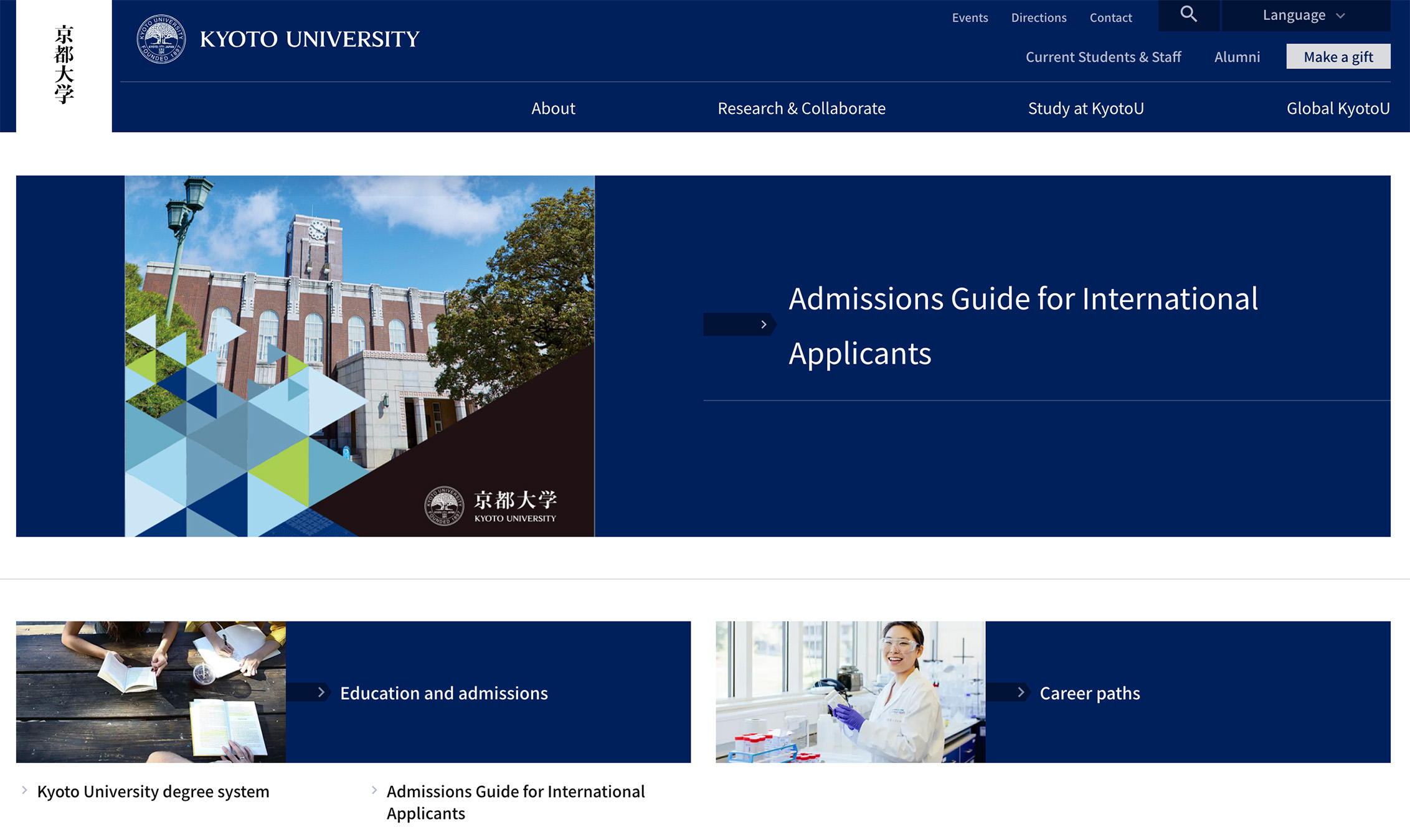
In practice, that means headings need to communicate function, spacing needs to show grouping, and typography needs to signal hierarchy without relying on heavy decoration. Institutional examples that demonstrate Japan’s emphasis on clarity and readability include the Digital Agency, major municipal portals like Yokohama City, and large universities such as Kyoto University.
Why This Is Becoming More Pronounced in 2026
Accessibility and readability become more pronounced in 2026 because Japan-facing teams need to design for a wider range of ages, abilities, and digital habits, and inclusive defaults are increasingly the safest baseline.
Three forces are making this shift harder to ignore:
- Audience ranges are broad: Japan’s aging population makes it risky to optimize for a narrow segment.
- Device usage remains diverse: users move between mobile and desktop, so readability needs to survive real-world constraints.
- Inclusive design is a long-term investment: when accessibility is built into the system, it can reduce redesign cycles and improve trust.
Takeaways for International Teams
International teams sometimes expect accessibility work to look like prominent badges, toggles, or explicit “accessibility features.” In Japan, accessibility is often less visible and more embedded, built into typographic rules, layout decisions, and predictable interaction patterns.
Three takeaways tend to matter most for Japan-facing projects:
- Accessibility is a quality signal: it reads as professionalism and care, not a special mode the user needs to discover.
- Visual simplicity does not mean reduced information: pages can feel calm while still carrying a high volume of content.
- Typography often does more UX work than interaction design: investing in hierarchy, spacing, and content patterns can deliver more impact than adding motion or novelty.
Trend 3: Information Density; Now with Improved Structure and Control
Information Density as a Feature, Not a Flaw
Japanese websites are often described as “busy” by international observers, but that framing misses the point. In many Japanese contexts, density is a feature, it reflects expectations for completeness and transparency, and it assumes users can navigate complexity when the interface is structured well.
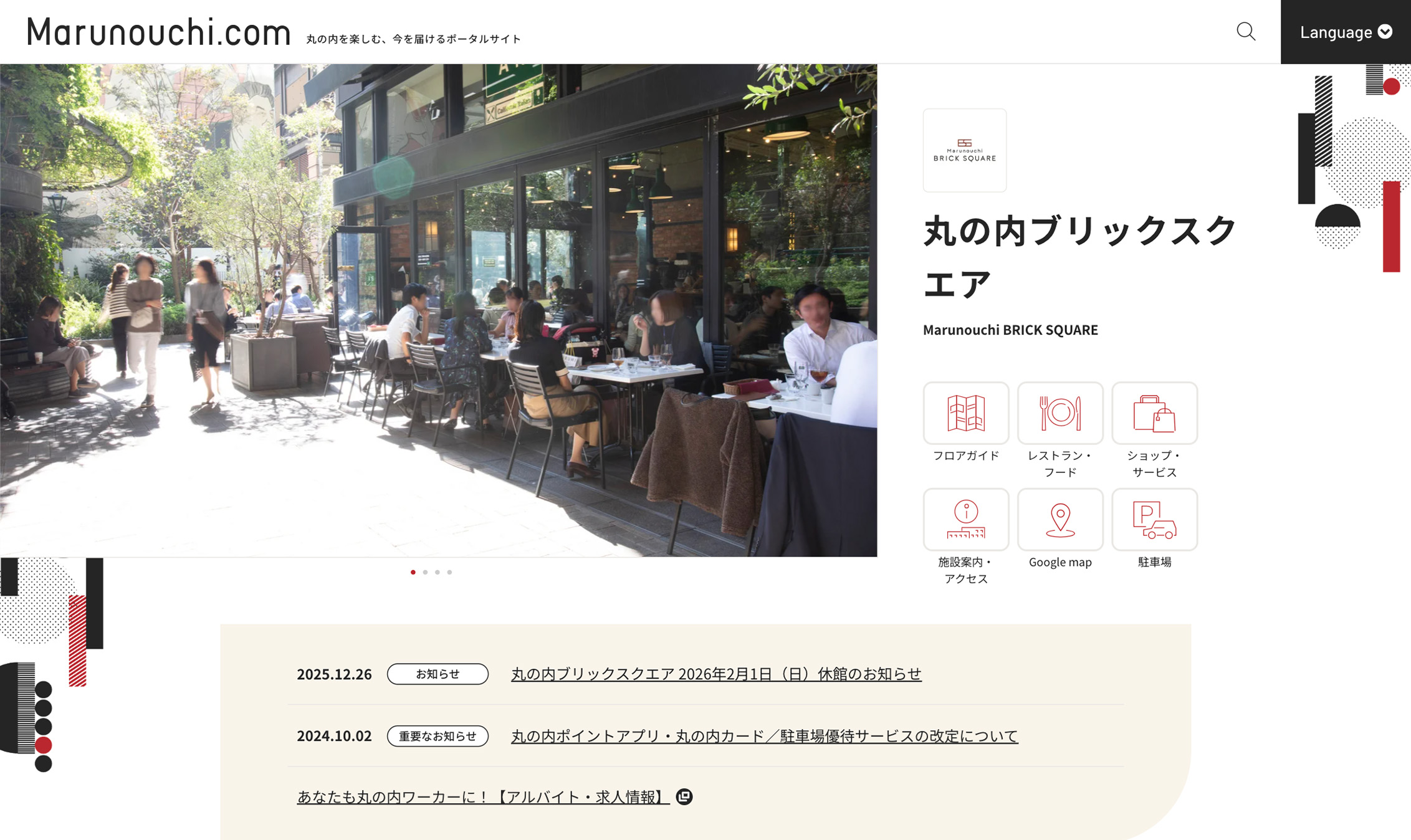
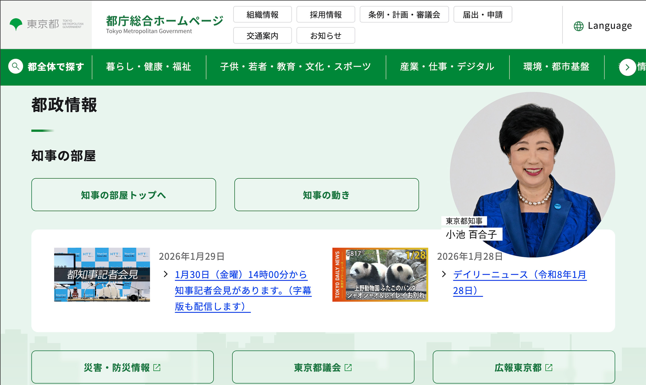
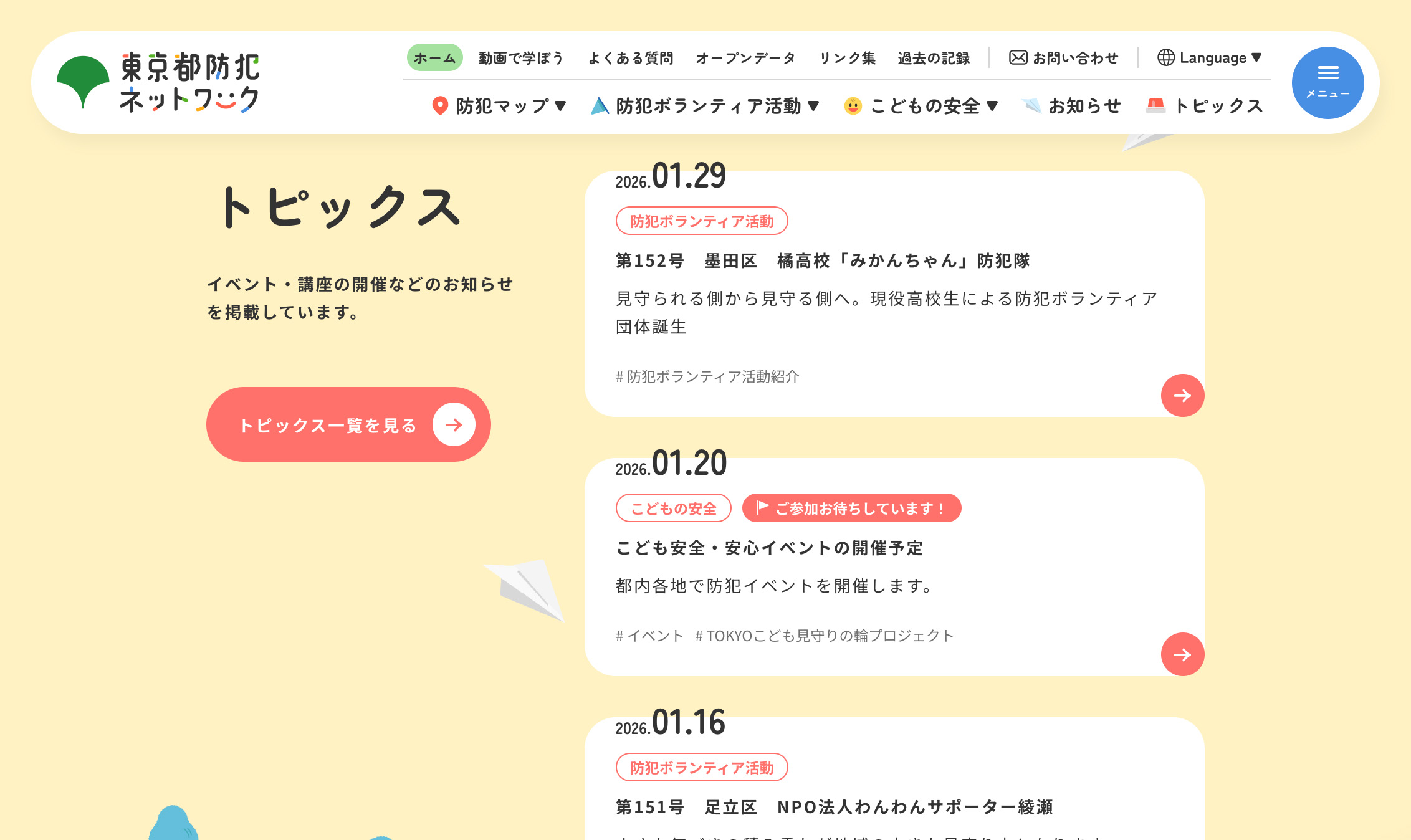
The goal is to provide enough information for the user to make a confident decision, whether that decision is choosing a product, understanding a policy, comparing options, or confirming steps. Japan Web Design Gallery references like the Tokyo Metropolitan Government, the Tokyo Metropolitan Crime Prevention Network, and Marunouchi.com illustrate how dense content can still feel navigable when hierarchy and rhythm are handled well.
Structure as the Primary Design Tool
If density persists, structure becomes the primary design tool. In 2026, Japanese teams appear increasingly focused on clear hierarchies, consistent grid systems, and predictable navigation patterns, not because these choices feel conservative, but because they make complexity usable at scale.
Structure enables three behaviors that matter in information-rich experiences:
- Scanning: stable heading systems, consistent spacing, and visible groupings help users orient quickly.
- Pausing: clear wayfinding and predictable components let users stop and resume without re-learning the interface.
- Deep dives: segmentation and hierarchical navigation keep detail discoverable without becoming chaotic.
In other words, structure is what makes density usable, and it is often the difference between “busy” and “complete.”
Control Over Complexity
Another shift in 2026 is the emphasis on control over complexity. Rather than hiding content behind aggressive simplification, designers increasingly focus on making dense interfaces feel legible and steady.
In practice, that control is usually achieved through three linked moves:
- Organize it: group related content so the page reads as a set of clear sections, not a continuous stream.
- Segment it: break detail into predictable chunks, such as tabs, accordions, or structured subpages, without making information harder to find.
- Make it predictable: keep patterns consistent so users know what to expect when they navigate, expand, or compare.
This approach can reduce anxiety in information-heavy contexts. Users can see that the information exists, understand how it is grouped, and choose how far to explore, which is particularly valuable when they need to verify details, compare options, or confirm procedures.
Why This Pattern Persists Into 2026
Information density persists in Japan because it aligns with what many users value. Transparency can matter more than abstraction, and access can matter more than curation, especially when users arrive with a specific goal and want to verify details rather than accept a simplified summary.
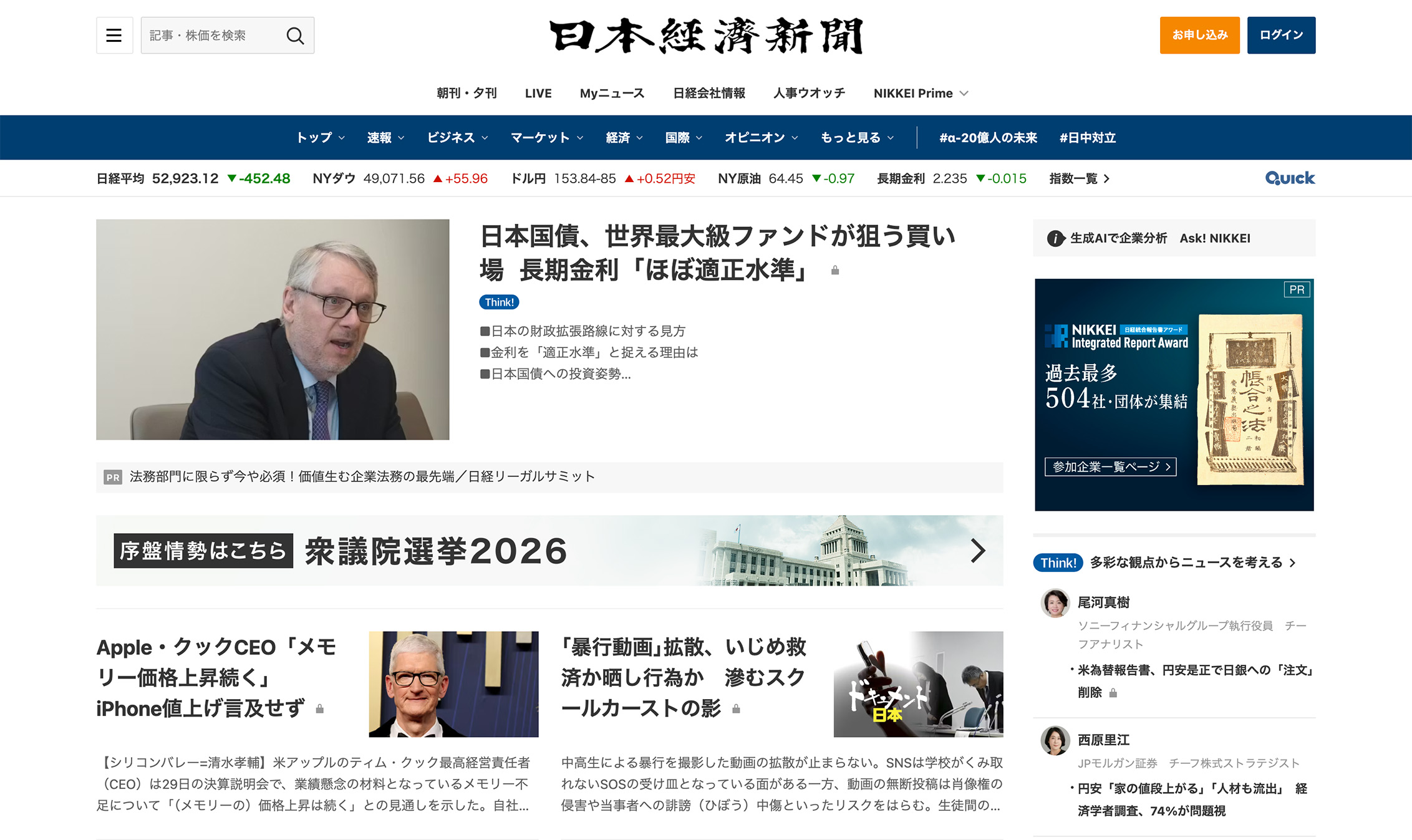
This is especially relevant for media, government, and large corporate ecosystems, where users often expect comprehensive information and clear paths to the specifics. Examples of this density, and the way structure makes it usable, can be seen in major Japanese publishers like Asahi Shimbun, Yomiuri Shimbun, and Nikkei.
Strategic Implications
For teams building for Japan, density changes what “good UX” means. The goal is not to make pages feel empty, it is to make complexity feel controlled.
Three strategic implications follow from that shift:
- Design systems need to support scale and density: components should handle long labels, multi-level navigation, and content-heavy states without breaking.
- Content modeling and hierarchy become core UX skills: teams need to define relationships between content types, align navigation to those relationships, and set typographic rules that keep the structure legible.
- Simplification means clarifying relationships, not removing content: users still expect depth, but they need clearer paths through it.
What These Trends Reveal About Japanese Design Values in 2026
Taken together, these three trends point to shared principles, and they help explain why 2026 feels like a year of refinement. The through-line is not a specific layout style or color preference, it is a set of values that shape how Japanese teams define quality.
In many Japan-market projects, “better design” increasingly means reducing avoidable friction and making complexity feel manageable. That value system shows up in three related forms of respect:
- Respect for time: performance is treated as part of perceived care and competence, not a backend detail.
- Respect for attention: quiet interfaces avoid demanding engagement without purpose, and they keep the user’s task in the foreground.
- Respect for cognitive effort: structure and typography make complexity navigable, so users can scan, pause, and return without getting lost.
In 2026, Japanese design appears increasingly optimized for long-term use, repeated visits, and broad audiences. The emphasis is on trust, predictability, and quiet confidence, and that reframes what innovation looks like. The most meaningful improvements may not be visually dramatic, but they are felt quickly, in how smoothly the site loads, how readable it is, and how reliably it supports real tasks.
Applying These Insights Beyond Japan
Japan is often treated as a source of distinctive visual inspiration, but copying surface aesthetics misses what is changing in 2026. The real shift is in priorities, and those priorities are transferable.
Performance can be treated as a UX signal, because users read speed and stability as care. Typography can be treated as infrastructure, because type rules often do more navigation work than interaction design. Design systems can be built for complexity, not just simplicity, so components and patterns can carry dense information without collapsing into chaos.
For international teams, Japan offers a lens into what mature digital ecosystems may value next, where the competitive edge often shifts from novelty to dependability.
In Closing: New Values Become New Standards
Japanese web design in 2026 is about normalization, not novelty. Clearer standards for what “good” feels like are becoming the default.
The most important changes are often invisible at a glance. Motion is used more selectively, structure does more of the navigational work, and accessibility and readability are treated as baseline expectations.
For designers and digital teams, the takeaway is that maturity is not the absence of style. It is the presence of intent, and Japan’s calmer direction suggests a future where digital experiences earn trust through clarity, performance, and structure. For teams planning a Japan-focused redesign or product experience in 2026, the biggest opportunities often sit in the fundamentals, and Netwise can help translate them into practical design and UX decisions that fit real organizational constraints.
This article is the first in a three-part series. In the next piece, we will look beyond structural trends and focus on subtler expressions of Japanese UX maturity, including how omotenashi shows up through microinteractions and how personalization is handled quietly through adaptive, context-aware interfaces. Rather than drawing attention to intelligence or automation, these designs create confidence by feeling appropriate, considerate, and frictionless in everyday use.