Our Work
ANA InterContinental Tokyo
Reimagining the online experience for this Akasaka icon

Situated in the heart of Tokyo’s upscale Minato district, minutes from Tokyo Tower, Roppongi, and Akasaka, the ANA InterContinental Tokyo sits like a bright star amid a bustling cosmopolitan firmament. Its 37 floors are home to 844 guest rooms, eleven restaurants and bars, twenty banquet halls, and a range of boutique shops and salons. Its guests come from all over the world, with hopes of experiencing the best that Tokyo has to offer.
Hotel websites abound but few of them, frankly, impress. When the folks at the ANA InterContinental contacted us (after reading our blog post about creating high-performing hotel websites) we know we had the opportunity to create one that would.
The client came with a fairly detailed list of requirements, which we further clarified and refined through a series of meetings and email Q&A. As a result, the Discovery phase of our standard website development process was abbreviated, and we moved right ahead with the design process.
First up was the site structure, developed over 2 weeks through in-person meetings with project team members on both sides and various client stakeholders. With the structure locked down we moved on to the wireframes, developing 18 unique page templates in all for PC, tablet, and smartphones.
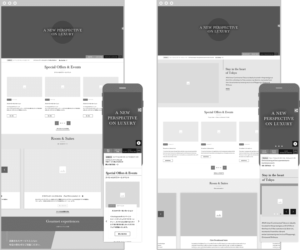
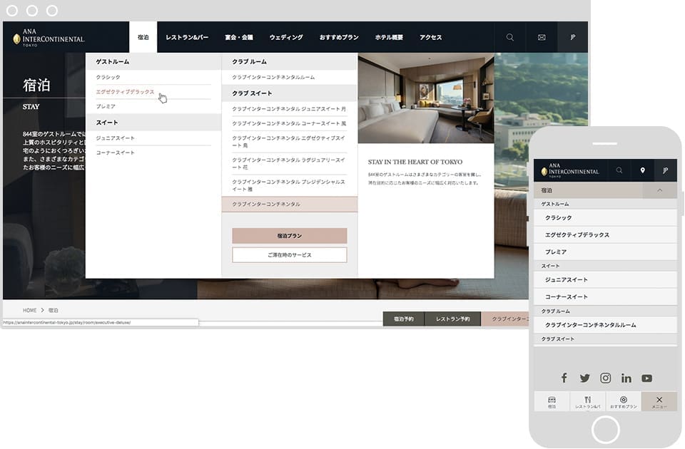
The wireframes comprised two sets, one for Japanese and another for English, Chinese, and Korean. The website architecture was designed to support a full Japanese site, a mostly-complete English version, and a stripped-down basic version in Chinese and Korean. An intelligent menu system allows the navigation and other UI elements to adapt automatically based on the chosen website language.
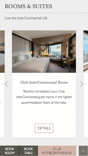
We created an always-on booking widget in the footer which can be either docked or left deployed as you like. It allows for one-click access anywhere in the website, on desktop, tablet, or smartphone, to the room and restaurant booking functions, in addition to Club InterContinental content.
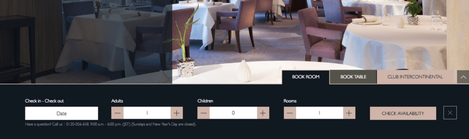
The smartphone experience is much the same, though we elected to use the entire screen for the booking forms. Tabs make it easy to switch between Room and Table reservations. Phone inquiries are merely a tap away.
We located the global navigation in the footer area, and coded it to hide–along with the header–automatically when scrolling down and appear again when scrolling back up, maximizing the viewing area for reading. An icon in the footer makes it easy to return to the top of any page.
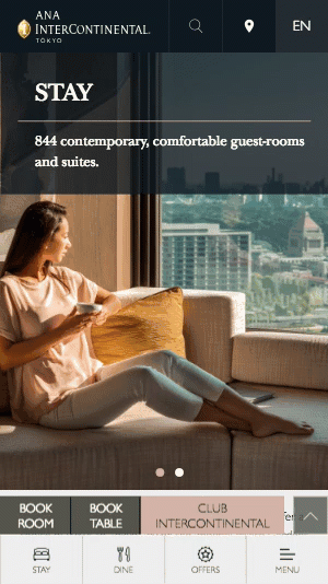
For the mobile header we put the most important items at the top, providing one-tap access to the homepage, website search, location info (with an embedded, brand-styled Google map), and language selectors.
With over half of the visitors to the current website now browsing using smartphones we looked closely at all aspects of the mobile experience, and worked hard to ensure we could deliver the same high quality, irritation-free experience across all device types.
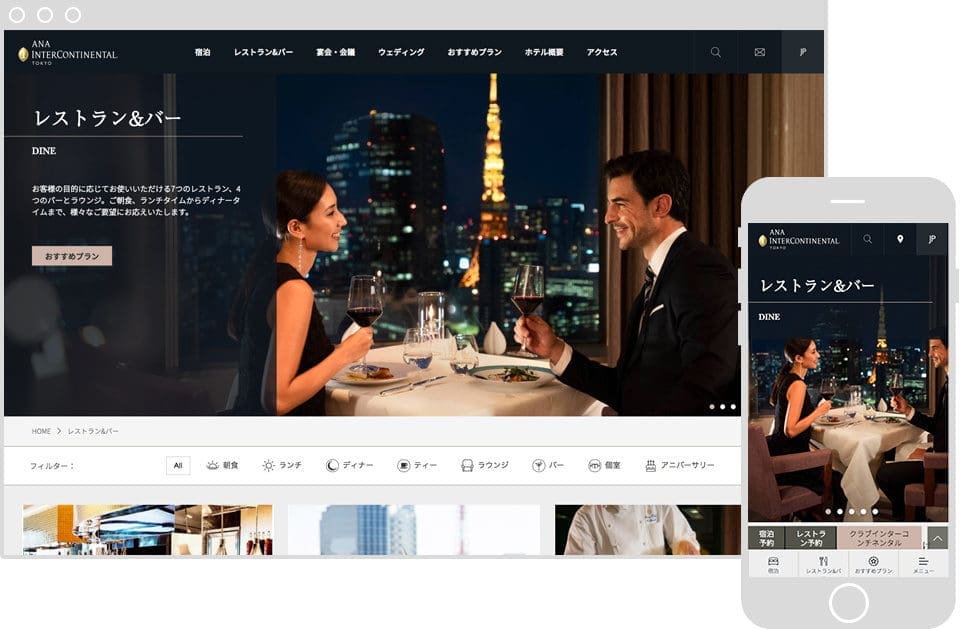
In the end we were able to create an exceptionally well-optimized responsive design that looks and works great pretty much everywhere. Controls are easily accessible, pages load quickly, and global navigation elements are docked neatly out of the way when scrolling down in read mode. And of course it’s fully multilingual.
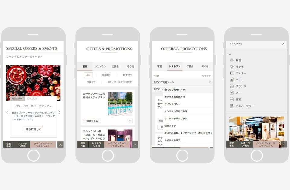
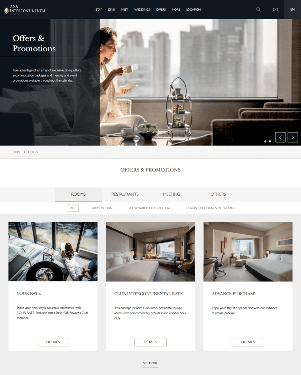
Another area we invested heavily in was the Offers & Promotions. In Japan, package deals for rooms, dining, and more are more or less a given, and their presentation can have a profound impact on the degree to which a hotel website converts visitors to guests.
We created a modularized and highly-configurable management function for offers which allows for:
- Different offer types
- Featured Offers (displayed on homepage)
- Auto-expiry (offer expires on a specific time and date)
- Offer can be associated with restaurants (to be displayed on restaurant pages)
- All offer types in a single page with a tabbed layout
- Filter offers by tag or restaurant
- “See more” feature which reveals a new row of offers
To dress up the UI a bit we created a range of icons to use for restaurants and room amenities. These add some design flair to the website pages, especially in the Dine section, where they have been included in the dynamic, one-click filter function.
![]()
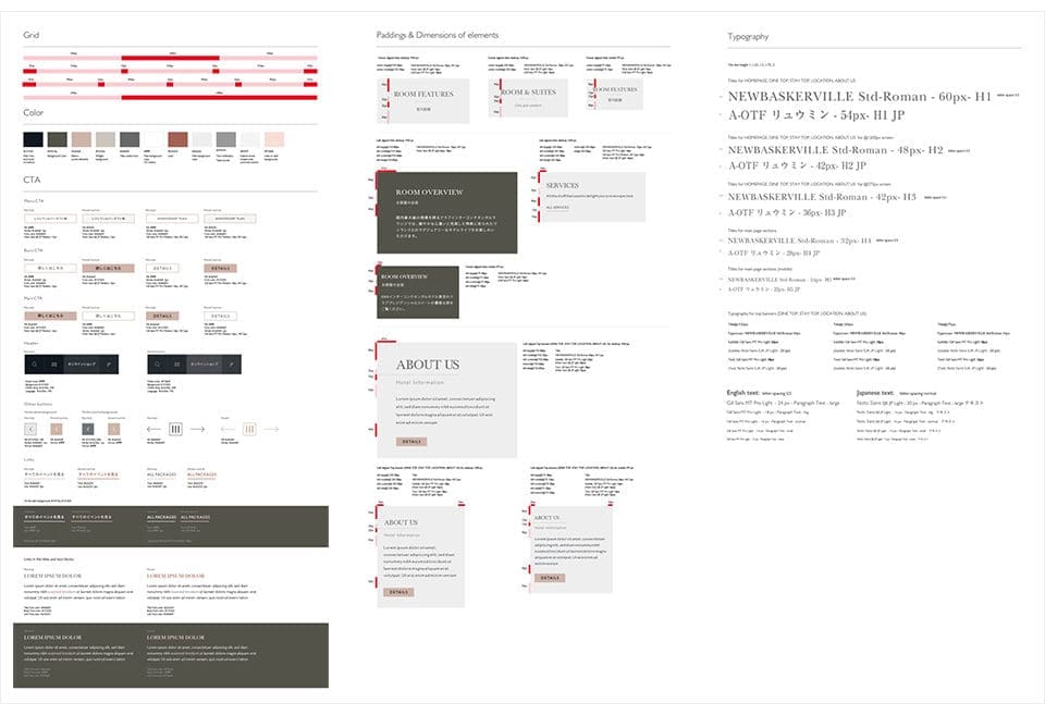
Finally, we also created and provided a website styleguide to use as a reference by both the Netwise team and ANA InterContinental going forward. It covers everything from colors to typography to spacing and even the website grid.
Client:
ANA InterContinental Tokyo